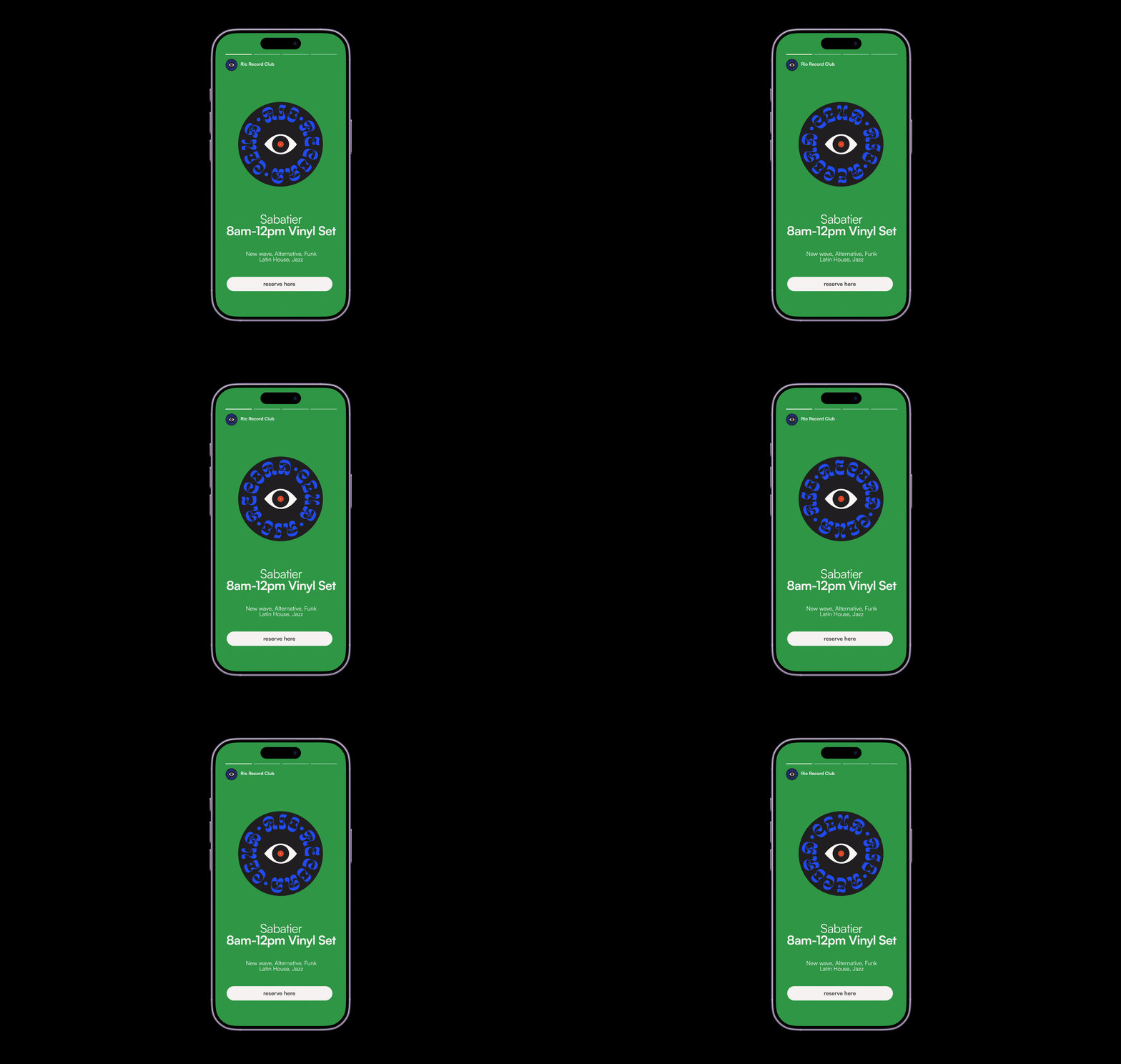
As the designer behind Rio Record Club's brand identity Ana developed the complete visual identity for a new community-focused record store and cultural hub located in the heart of Rio Puerto Rico. Rio Record Club is more than a vinyl shop, it is a gathering place for music lovers, artists and the local community to celebrate music, art and culture through a curated record collection, a cozy coffee shop, a community event space, live music performances, art exhibits and workshops. Ana was responsible for building a brand identity that captured the warmth, creativity and cultural richness of the space while positioning Rio Record Club as a premier destination for the arts and culture community in Puerto Rico. The visual system she developed had to communicate across multiple touchpoints including signage, print collateral, digital assets and event materials while remaining flexible enough to serve the diverse programming and community-driven spirit at the core of the brand. This project reflects Ana's ability to build brand worlds from the ground up, translating a client's vision and community values into a cohesive and compelling visual identity that resonates deeply with its intended audience.
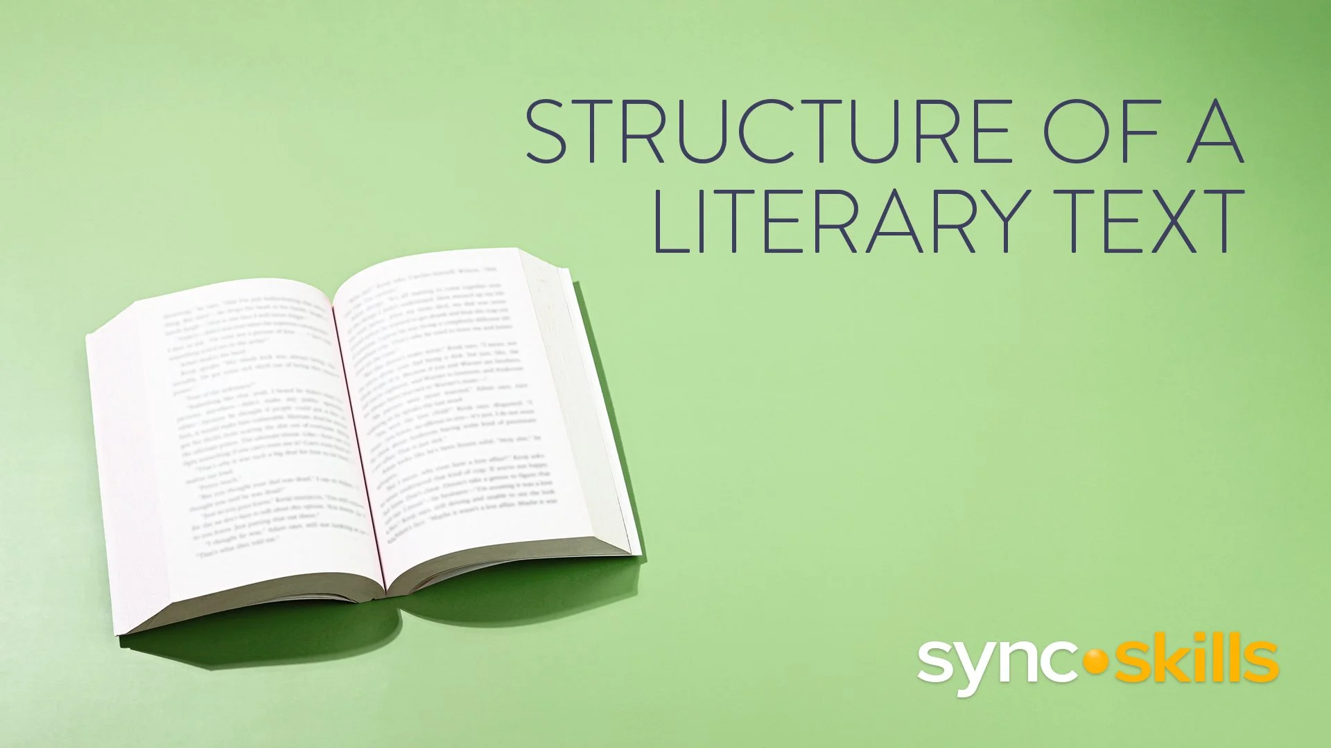
In her current role as Graphic Designer at Imagine Learning, Ana leads the design and production of curriculum materials for the StudySync K-12 ELA program, one of the most widely used literacy curricula in the United States. She oversees the full design lifecycle of a library poster suite of book covers across multiple grade levels using an AI-assisted hybrid workflow that integrates Adobe Firefly for image generation with Photoshop for compositing and retouching and InDesign for final layout and typography. She also conducts design reviews for the StudySync California 2028 Curriculum, providing guidance and quality oversight to production designers across both student and teacher editions while ensuring all deliverables meet Section 508 and WCAG accessibility standards. Collaborating closely with Academic Directors and Design Directors through iterative review cycles Ana manages multiple concurrent production projects simultaneously, consistently delivering production-ready assets on schedule for both print and digital distribution across Imagine Learning's curriculum portfolio.
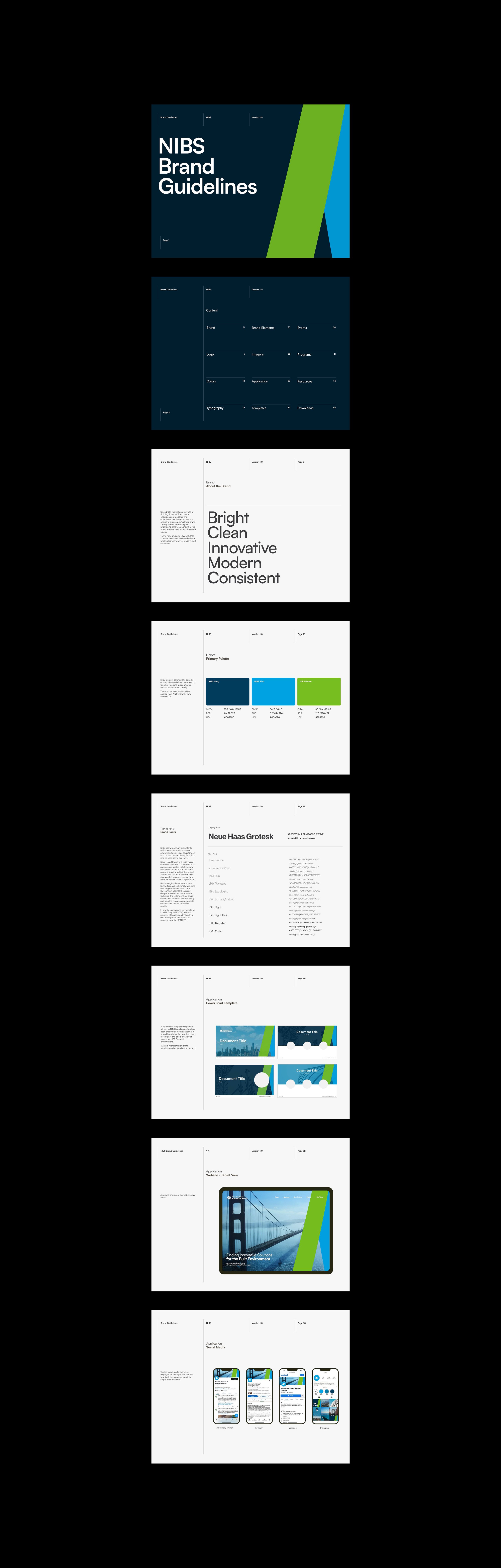
During her tenure as Senior Graphic Designer at the National Institute of Building Sciences, Ana led a full organizational rebrand from the ground up, owning every aspect of the project from initial brand audit and stakeholder alignment through comprehensive brand guidelines, visual identity system development and final production. She redesigned the organization's annual report as the flagship expression of the new brand, creating a cohesive and elevated publication that communicated the authority, credibility and forward-thinking mission of an institution working at the highest levels of government and the building industry. That work earned a Hermes Creative Award for Best Annual Report Design, one of the most respected honors in the communications and design industry, recognizing not just the aesthetic quality of the work but the strategic thinking, craft and production excellence behind it. Beyond the award Ana built scalable design systems and production templates that reduced turnaround time by 25% and enabled consistent high quality creative output across organizational assets, leaving a lasting impact on the organization's visual communications long after the initial project was complete.
Reports and other projects available upon request.
As a freelance designer for Dolcezza Gelato, a beloved artisan gelato brand, Ana designed and developed push pop labels for eight distinct gelato flavors, working within the brand's established typography, logo standards and graphic parameters to create packaging that felt cohesive, premium and shelf-ready. Each label required careful attention to brand consistency, color accuracy and print production specifications to ensure the final packaging met both the aesthetic standards of the Dolcezza brand and the technical requirements of physical product manufacturing. Ana also designed a one-page product sheet for Dolcezza's pint flavors intended for nationwide supermarket distribution, creating a polished and visually compelling sales tool that communicated the brand's artisan quality and flavor range to retail buyers and grocery partners. To bring the product sheet to life Ana also served as the project photographer, capturing original imagery of the ingredients and gelato pints featured in the piece, demonstrating her ability to contribute across both design and visual content creation to deliver a fully integrated and production-ready final deliverable.
As Graphic Designer at JLL Americas one of the world's leading commercial real estate firms Ana led the design and production of integrated digital and print marketing collateral for the Mid-Atlantic region, supporting property branding and client engagement efforts on a nationwide scale. She built and maintained comprehensive brand guidelines and designed across a wide range of formats including logos, brochures, email campaigns, infographics, social media ads, signage, property websites and multimedia assets, ensuring every deliverable aligned with JLL's rigorous corporate brand standards while adapting creatively for channel-specific and audience-specific needs. Ana collaborated closely with property marketing teams across JLL Americas to define brand identity, establish project timelines and ensure alignment across multiple high-profile campaigns simultaneously. Her user-centric approach to marketing design contributed to measurable increases in online inquiries and leads, demonstrating her ability to deliver creative that is not just visually compelling but strategically grounded in real business outcomes.
As the designer behind Jane Jane's brand identity Ana led the complete visual brand development for a new cocktail bar opening on the vibrant and highly competitive 14th Street corridor in Washington D.C. This project required building a distinctive and memorable brand identity from the ground up that could hold its own in one of the city's most dynamic and design-forward neighborhoods, attracting a discerning audience of cocktail enthusiasts and nightlife regulars while communicating the unique personality and atmosphere of the space. Ana developed the full visual identity system including logo design, typography, color palette and graphic language, ensuring every element worked cohesively across all brand touchpoints from menus and signage to digital assets and event materials. The Jane Jane brand needed to feel simultaneously sophisticated and inviting, rooted in the energy of D.C.'s cultural scene while carving out its own distinct visual identity in a crowded market. This project showcases Ana's ability to translate a client's vision and brand personality into a visual world that feels intentional, original and fully alive from the very first impression.
During her time as Graphic Designer at the Endocrine Society one of the world's most respected professional medical organizations Ana designed and produced a wide range of digital and print communications working within the organization's established brand standards including typography, logo usage and visual guidelines. Her work spanned infographics, social media content, banner ads, print and digital brochures, flyers, logos and presentation materials, all created to communicate complex medical and scientific research findings to both professional and public audiences with clarity, accuracy and visual impact. Ana collaborated closely with the creative director and society leadership to define brand identity, set UX goals and align deliverables with organizational strategy and communication objectives, ensuring every piece reflected the Endocrine Society's commitment to scientific excellence and audience engagement. She also presented design concepts to society stakeholders, actively incorporated feedback through structured review cycles and coordinated with print vendors to ensure high quality production standards across all physical materials. This experience deepened Ana's ability to work within regulated science-driven environments where precision, brand consistency and audience sensitivity are non-negotiable and where design must serve both the integrity of the content and the needs of a highly educated and discerning readership.
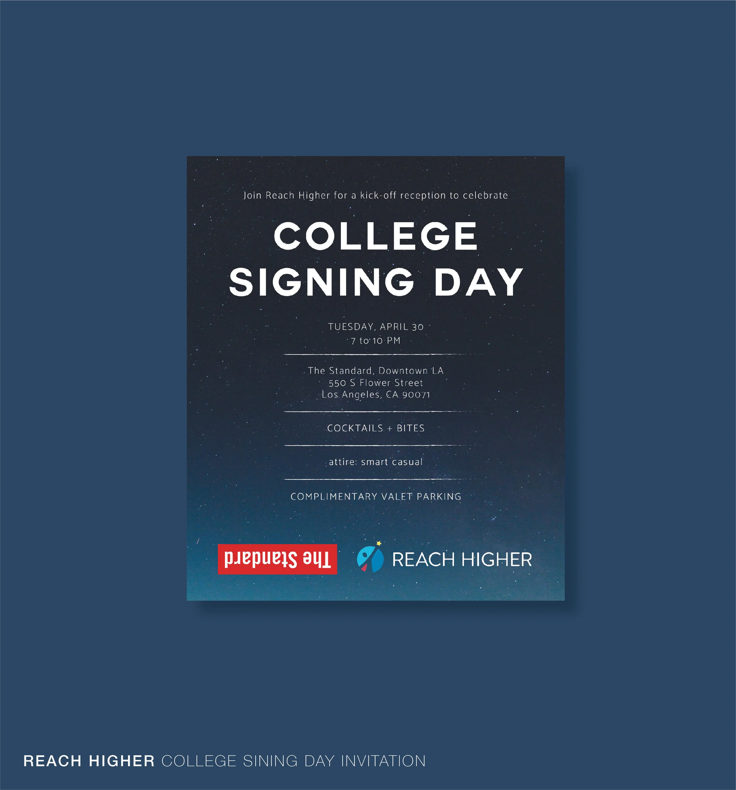
Designed a suite of branded event materials for two high-profile Reach Higher initiatives in collaboration with the Better Make Room campaign. For the College Signing Day reception Ana designed a polished event invitation aligned with Reach Higher's visual identity including logo usage, typography and brand standards. For the Reach Higher and ASCA Dinner celebrating school counselors across the country Ana designed a complete event collateral package including the dinner menu, program, name tags and table cards, ensuring a cohesive and elevated guest experience from arrival through the close of the event. Both projects required meticulous attention to brand consistency, print production specifications and tight turnaround timelines.
Designed and developed a bespoke event invitation for the launch of Doyle, the new signature restaurant at The Dupont Circle Hotel, part of the prestigious Doyle Collection. The invitation required a refined and sophisticated visual approach that reflected the hotel's elegant brand identity while capturing the excitement and exclusivity of a new restaurant opening in one of Washington D.C.'s most iconic neighborhoods. The final piece balanced typographic precision, premium print production standards and brand alignment to create a first impression worthy of the Doyle Collection's reputation for world-class hospitality.
Designed and developed a complete brand identity package for the Asociación de Neuropsicología at Carlos Albizu University in San Juan, Puerto Rico. The project included the design of an original logo that captured the academic and scientific nature of the organization while reflecting its Puerto Rican roots, along with a cohesive stationery suite and promotional flyers for use across university events and outreach initiatives. The work required a thoughtful balance between professional credibility and approachable visual communication, ensuring the association's materials felt both authoritative and welcoming to students, faculty and the broader neuropsychology community.
Developed a logo design proposal for Goliat, a heavy metal band, creating a bold and distinctive visual identity that captured the power, intensity and attitude at the core of the band's sound and persona. The design process involved exploring typographic treatments, custom lettering and graphic elements that felt authentically rooted in heavy metal visual culture while giving Goliat a unique and ownable mark to build their brand around. The proposal delivered a strong and versatile logo concept that could translate effectively across album artwork, merchandise, stage visuals and digital platforms.
Designed and developed a branded itinerary and event invitation for ELOQUII's #ModelThat tour stop in Washington D.C., working within the brand's established campaign imagery, color palette and typography to create polished and cohesive event materials that felt like a seamless extension of the campaign's bold and empowering visual identity. ELOQUII is one of the leading plus-size fashion brands in the United States and the #ModelThat campaign was a culturally significant initiative celebrating confidence, style and representation in fashion. The deliverables required a deep understanding of the brand's visual language and a meticulous approach to asset integration, ensuring every design choice honored the campaign's energy and elevated the guest experience for one of the tour's marquee stops.
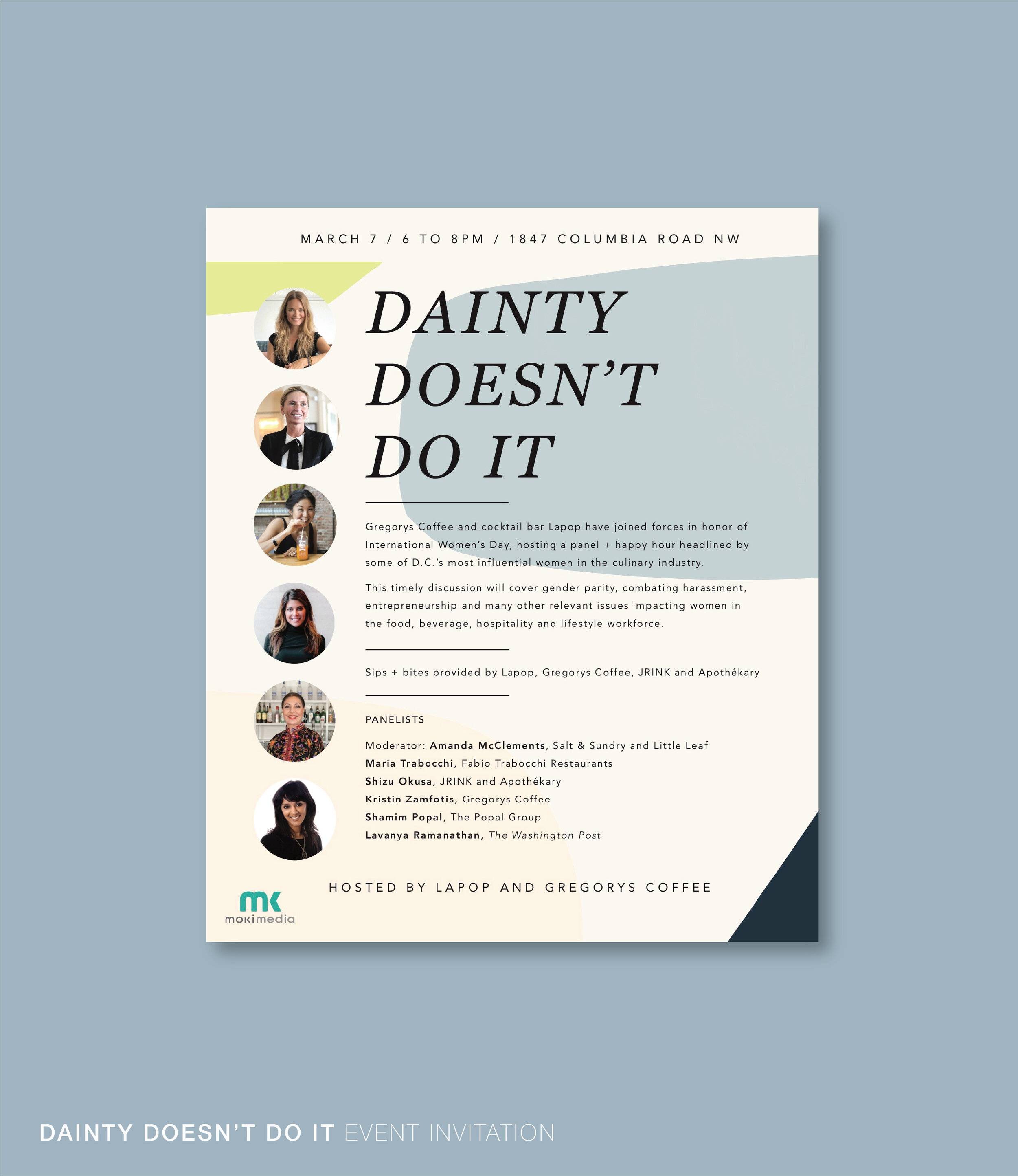
Designed and developed a complete suite of event materials for #DaintyDoesntDoIt, a bold and culturally resonant International Women's Day panel event celebrating women who defy expectations and redefine what strength looks like. The project included a striking event invitation, dinner menus and large-format screen projection graphics designed to set the tone for a powerful and memorable evening. Every piece was crafted to reflect the unapologetic energy and visual confidence of the event's message, balancing typographic strength, intentional color and cohesive brand expression across both print and digital formats. The screen projection graphics in particular required a strong understanding of large-scale visual impact and how design reads in a live event environment, ensuring the brand presence felt commanding and immersive from every seat in the room.
Collaborated with Gregory's Coffee on two distinct branded design projects that required a strong understanding of the brand's visual identity and its application across both print and digital formats. For the Washington D.C. Women's March Ana designed a promotional coffee voucher for distribution at the event, integrating Gregory's Coffee's logo, brand information and imagery into a clean and eye-catching piece that felt both on-brand and culturally connected to the spirit of the march. For a Gregory's Coffee and Flywheel co-branded activation Ana designed an Instagram Story graphic that brought together both companies' logos and visual assets into a cohesive and platform-native social media deliverable optimized for engagement and brand visibility. Both projects required meticulous attention to brand standards, asset management and the specific format requirements of their respective channels.
Designed a suite of event invitations for the opening events of Skybox, a 70s themed venue, capturing the groovy energy, bold aesthetics and retro personality of the concept through every design detail. The invitations drew inspiration from the visual language of the era including expressive typography, warm earthy color palettes and graphic elements rooted in 1970s design culture, creating a first impression that instantly transported guests into the world Skybox was bringing to life. Each piece balanced nostalgic visual references with a polished and production-ready execution, ensuring the final deliverables felt both authentically on-theme and worthy of the excitement surrounding the venue's opening events.
Led the complete brand identity development for Ink Nail Bar, a luxury nail salon based in Maryland, designing and producing a comprehensive suite of branded materials from the ground up. The project encompassed logo design, stationery, business cards, staff uniforms, packaging and additional brand collateral, creating a fully cohesive visual identity that communicated the salon's premium positioning and distinctive aesthetic across every customer touchpoint. Ana worked closely and collaboratively with the owner and founder throughout the entire process, taking the time to deeply understand her vision, values and the experience she wanted to create for her clients before translating that vision into a polished and intentional brand world. The result was a sophisticated and scalable identity system that elevated Ink Nail Bar's presence and set a strong visual foundation for the business to grow from. This project reflects Ana's ability to own a brand from concept to completion while keeping the client's voice and vision at the center of every creative decision.
Designed and developed a polished informational venue guide for H2 Collective, integrating the company's existing imagery into a clean, well-structured and visually compelling layout that made the space and its offerings immediately accessible and appealing to prospective clients and guests. The guide required a thoughtful approach to information hierarchy, typography and visual flow, ensuring that complex venue details and event specifications were communicated clearly and elegantly without overwhelming the reader. The final deliverable reflected the brand's identity and elevated the way H2 Collective presented itself to its audience, functioning as both a practical resource and a powerful first impression of the venue's quality and experience.
Designed and developed a complete brand identity package for IB Group, a women-owned professional accounting firm, creating an original logo and cohesive stationery suite that established a strong and credible visual presence for the business. The project required a refined and trustworthy aesthetic that communicated the firm's professionalism, reliability and expertise to its corporate clientele while maintaining a clean and contemporary visual language that felt modern and distinctive within the financial services space. The logo and stationery system were designed to work seamlessly across both print and digital applications, giving IB Group a polished and consistent brand foundation to build from as the firm continues to grow. This project reflects Ana's genuine commitment to supporting women-owned businesses and her ability to craft identities that convey authority, confidence and credibility from day one.
Led the complete brand identity development for Toma Café, a Puerto Rican coffee shop, designing and producing a comprehensive suite of branded materials that brought the brand to life across every customer experience. The project encompassed logo design, menus, cups, business cards, packaging and stationery, creating a fully cohesive visual identity system that captured the warmth, authenticity and local pride at the heart of the Toma Café brand. Every design decision was rooted in a deep respect for Puerto Rican culture and the unique community a neighborhood coffee shop builds around itself, resulting in a visual world that felt both inviting and distinctly its own. From the first sip to the last touchpoint Ana ensured that every branded element told a consistent and compelling story about who Toma Café is and what makes the experience of visiting one of their locations truly special. This project reflects Ana's deep connection to her island roots and her ability to build brand identities that resonate authentically with the communities they serve.
Led the redesign of the complete brand identity for Frequency Media, refreshing the organization's logo and developing a cohesive suite of branded materials including business cards, an informational booklet, stationery and additional collateral. The rebrand required a thorough understanding of the existing brand equity and a careful balance between honoring what was already working and evolving the visual identity into something more modern, distinctive and strategically aligned with where Frequency Media was headed. The new logo served as the anchor for a refreshed visual system that carried through consistently across every deliverable, ensuring the brand felt unified, professional and ready to make a strong impression across both print and digital applications. The informational booklet in particular required a strong command of editorial layout, information hierarchy and visual storytelling to present Frequency Media's offerings in a way that was as compelling as it was clear. This project reflects Ana's ability to approach a rebrand with both creative ambition and strategic sensitivity, delivering work that respects a brand's history while confidently moving it forward.